Monday 27 September 2010

Wednesday 22 September 2010

Music Video Auteurs.

Michael Gondry:
Example: The White Stripes- Fell in love with a girl.

From looking at a number of Gondry's music videos, it is clear to say that they are unusual and use a high level of special effect camera work. The example I have chosen out of the many video's that Gondry has choreographed in recent years, is the white stripes video- 'Fell in love with a girl'. The use of Lego figurines is imminant right the way through the video and is shown in a repetitive manner. I feel this video swings from the entropic side of music videos, but also represents a redundant side. An example of this is that Lego character's can't physically show human emotion, but it is now in this day and age that animals and man made objects are shown with human feelings on music video's and films.

Monday 26 April 2010

Question 7: Looking back at your preliminary task, what do you feel you have learnt in the progression from it to the the full product?


Looking back at the preliminary task, I feel as though I have improved knowledge and understanding of all Photoshop, Quark, DSLR Camera's and Blogger. Although I have enjoyed the construction of both magazines, I feel as though I can construct, challenge and improve many images and text structure's which I may of not been able to do so in my preliminary task. With the help of Photoshop I feel that i have used it to its full potential for my music magazine, rather than my preliminary task, where I was only gave an amatuer performance and gave out a simple, yet boring magazine front cover. I have now learnt to remove items from an image for example people, the use of shaddowing to give a more boldness feel about my magazine, and of course the angle of images and text on my front cover, which should enable the overview of my final product to become a wierd but wonderful view about it.
Another way how i feel I have advanced from when i made my preliminary task, is that I now feel more independent when working on my product. When we first made the college magazine, we had to work in pairs which I felt was a bit frustrating as you could'nt put your points accross and use certain images unless the other person agreed. Although I felt me and my partner worked well and produced college magazine of a good standard, It was difficult to achieve anything on Photoshop and Quark, because none of us were familiar with the different tools and proccesses to make our magazine stand out from the rest. I also felt that working on my own, I could fit the completion of my magazine around my lifestyle. For example when we completed the preliminary task, It was difficult to get both partners working outside of lessons due to different timetable's. With both class time, outside of lessons and working at home, I felt the proggression of my media magazine could be undertaken with ease, and I would be able to finish with a good quality standard of work. I feel i have done this.
I also felt that i spent a lot of time researching my target audience. I feel that this proved as an advantage as in the preliminary task, me and my partner only based our college magazine on what we thought we be suitable. Using the stereotypical view of a certain genre e.g. Indie would of been the wrong thing to do, as i found out alot of detail when researching my freinds and how they felt was most important to them about this sub genre of music.
Organising was the key. I felt that by organising and timing my media magazine, by doing little bits at a time, was very effective in the completion of my final product. As in the preliminary task, me and my partner left it till the last minute to complete our colege magazine. I feel that this was the wrong thing to do as we made little errors which could of effected our marks. One of these little mistakes was the size of the masthead. We originally planned it to be a lot smaller which would enable the final magazine to be more unique towards the readers. I felt that doing little bits at a time, and doing work out of lesson time, helped the completion of my magazine easier as I had enough time to chop and change what i felt was right or wrong.
I also feel that by producing an effective plan or expanding on it makes the product seem better in the long run. For example in the preliminary task me and my partner did a really quick plan and started our main product straight after. By analysing the plans that i had made, a few weeks before the undertaking of my media product, i felt i could analyse each one to its full extent and expand on them. An example of this is the double page spread and how i used different colours of text to discuss the interview.

Question 6: What have you learnt about technologies from the proccess of contructing this product?

Whilst the proccess and completion of my music magazine, I have experienced using many new proggrammes which I feel would have been impossible to reach such a high standard of images, text, and colours if these proggrammes were not possible.


Abode Photoshop:


Before the construction of my media magazine, I had no previous experience of using photoshop, so therefore had no idea how to use it to its full extent. The only thing I thought this proffesional proggramme could do, was to remove spots from your face and make you look goregous. Throughout the proccess of my magazine I learnt that this was not the case. I found that you could edit images with a 'Lassoo' tool, and a 'Magic Paintbrush' to acheive the best image possible. I also felt that it makes your work stand out even more impotantly to you as you can use a free hand drawing object (lassoo), which allows you to draw, edit and colour in segments which is not normally possible on other editing sites such as paint etc. After editing many pictures for my front cover, Double page spread and contents, I now feel I am confident in using Abode Photoshop to acheive even better images, which I feel may stand out to the reader even more. An example of an image I used on my front cover, was the main cell. I used photoshop to remove people in the background which enabled the band member 'David Pitt' to stand out to the reader even more.

QuarkXPress: Like Photoshop, I didn't have any previous knowledge or understanding of how to use this proffesional proggramme. I used this product on my double page spread. At first i was going to use Photoshop for my double page spread, but because Quark is very easy to contruct lines, columns and tables, I felt that this proggramme would be exremely important in the completion of my double page. I also felt that inserting images into Quark was a very easy proccess to complete; for example after you have copied and paste your image into an image box, you can right click and it locates the item "fit to box". I felt that by using this important tool, it would minimise my image small enough to fit in the box, but without distauting the image completely and making it become hard for the reader to see exactly what is going on in the image.

DLSR Camera: I felt that by using such a highly equipped camera, this would make my music magazine stand out to the readers even more. I originally intended to just use the portrait setting (the one with the lady wearing a hat), but after trying and testing other settings, I felt the fast moving setting (the one with the man running) was the most effective, as it shows strong use of colours but in a blur'ry sequence. I also felt that the zoom and depth of field settings, made my magazine stand out even more. The fact that it was possible to zoom from such an angle and still have a great level of pixel of the model made my magazine seem proffesional and well worth the money.

Blogger: I felt that by using Blogger, I could blog, note, draft, analyse and delete any unwanted/wanted peices of material that would help me in the completion of my media product. I also feel that I am confident in using it, as i have completed a lot of media work on Blogger at home. The fact that its all saved onto the computer also makes it a lot easier to keep track on what i need to do For example: you can download images off facebook and include them into your blog space.
Overall: Overall I have enjoyed using the technologies that were given to me to complete my media magazine. As I have had no previous experience in using these particular proggrammes such as photoshop and Quark, I now know how to transform, edit and construct images from scratch to make the image or text stand out to the reader even more. Although constructing many of the images was not easy, I feel I have proggressed strongly and now understand to continue with my next media project using all of these proggrammes.

Sunday 25 April 2010

question 5: How did you attract/address your audience?


To attract my niche but unique audience, I felt i had to use a range of colours, fonts and layouts to make the magazine lash out to my readers. By doing this I used in many cases the primary colours of red, white and blue. I felt that by using these well known colours especially as they simbolyse the mod target of the late 60's and 80's, this would immediately imply to the reader. Although i was trying to compare my magazine to others such as NME or Q which i thought were simular to mine, from the start i wanted my magazine to be one of a kind, so by doing this, it would make my magazine seem a unique product, that only proper music lovers would buy. The reason why i used big, bold and bright colours to make my magazine stand out to my target audience was because i feel as though my psychographic groups needed to have a sence of fun, strong willed and relaxed atmosphere about the front cover, double page spread and contents. Although i used a sence of fun loving colour sceme, I made sure that i didnt want to make my music magazine product seem as though it was immature and mainstream. To enable this, I used striking images such as nude, swearing, graffiti etc to put my point accross to the viewer. I also included text on my front cover such as "Lets go have the f****n world!". This should hopefully suggest to the reader that it is not a mainstream magazine where all younger teenagers buy it and aspire to be like their favorite artist, wheras the artists in my magazine are like the people of the public. The choice of colour on my images also backed the bright, full of life colours on my front cover. For example i used a clack and white image on my strapline to give the sence of retro and unique feel about my product, which I feel would attract my target audience even more, due to the fact that my magazine's sole purpose was to relive and celebrate some of the former glory of rock music in Great Britain. Like i mentioned earlier, i tried to aim my music magazine at a range of different psychographic groups, but also a range of groups on the jicnar scale. To acheive attracting both audiences I felt i needed to change the choice of language used when discussing to type of bands which I had included in my magazine. For example a working class band used a lot of taboo termonology- "lets fuckin' ave' em'." For the middle class band i used striking images such as running through a field with designer clothes on. I felt that by dressing my bandmembers in such a way e.g. parka's; this would enable my middle class readers a sence of pride towards this band- giving them a voice and breaking the steriotypical view of middle class students being all nerdy and not living their lives properly.
Double page spread.
Comparing my double page spread to other simular magazines for example Kerrang, NME and Q, I feel as though they have a lot of simularities but also a lot of differences which i can comment on.
For example, The colour of the text and background is very different compared to Kerrang double page spread. The reason why i felt it was neccessary to use a white background, with standard text colour, was to show the calm but coolness about the band i was talking about. I felt that by using a hardhitting colour such as a black or a strong/dark red, this would not imply to same technique and awarness about my band to the readers. I also feel it would give off the wrong impression of the band. An example of this is that i didn't want my band to have the overview of a scary and dark group, who would be classed in the 'goth/emo' section of musical acheivement. I feel that the images also have a musical difference. For example the main cell of the Kerrang double page spread is of a man with his head bowed down with his microphone in his hand. I felt that by looking at this image, the impression of the band may seem sad and emotional on stage. The reason why i used cool, colours on my main cell for example a green field, green parka's etc i feel would give the reader a sence of happyness about reading the article on The Quads. IT also links with the type of psychographic genre i have used- hedonistics. The reason why i included to use an old building in the shot was the show the 'old' feel about my magazine, that has been brought back to life once more. I felt that this would compare the type of music i was so closely focused on. For example, bringing it back into life and re-living the greatest memories of the 'mod' era.
Kerrang double page spread:


The Reaign double page spread:
Comments from my target audience:
After the completion of my music magazine, i felt it was neccessarry to post my front cover, contents and double page spread onto facebook to acheive a bit of feedback to see what my target audience thought of my overall performance. As many of my friends are into the rock/indie side of music and fit the psychographics perfectly, I felt that their comments would really be helpful for my music magazine to be succesful.
Front Cover:
Dave Pitt: Good use of images, text and colour. Would really buy this music magazine if i had enough fucking money!
Oliver Russel: I think the colours attract my eye the most. The red, white and blue symbolising the mod target of that important era in music history, will give the readers full confidence in perchasing a copy. Well done.
Greg Bayliss: Aw shame about the language! I showed my mom when i got home and she couldn't believe her eyes when she saw the strong uses of 'F' words. maybe cover up the words abit and then i'll buy a copy. Shame :)
Rach Cassidy: Where can i get one?!
Contents:
Steve stokes: Woaw fair you've got Davey P in the nude ;). Reminds me of the old days in Birmingham. Congrats!
Gee Oliver: Liking the pictures Matty ;) shame about the white background but never mind! Where can i get a copy from?
Dan Winney: I can see you went to alot of effort taking these photos, I really like the dress sence as well which I feel people may apsire to purchase the same type of clothes. Just one question.. where can i get one of those fucking parka's from?
Double Page Spread:
Rich Mason: Loving the language Matty! i wish this band were real :(
Henry Pugh: I feel the background colours make the reader aware of the bands personality which is cool. Shame about the type of language used, but it does give off the bands reputation and dreams about taking over the world. congrats dude.
Vicky Ashmore: Brilliant! Dave Pitt sounds like a young Liam Gallagher in the early days of Oasis! Loving the sharpness and connection between the band members, loving the clothes, the scenery, the language and just the whole way the band are introduced. Gets my vote!
Overall.. Looking back at all the comments that were made on facebook, I feel as though I have acheived what i originally planned which was to give my magazine a hard but classy feel about it, Strong use of colour and images and of course the strong use of language. I also acknowledge the fact that I went to a lot of effort to take these images (Weston) and it is good to be recognised by the readers.
I also apreciate what needed improving. For example the use of language may seem abit to much for the 'lighthearted' readers of the Reign magazine. Although i tried to aim my magazine at boith areas on the jicnar scale, I particularly focused my double page spread on a working class band, with a working class view on the world.

Question 4: Who would be your audience for your media product?

The age range that I aimed my music magazine would be between 18-25. The reason why i chose this particular age group, was because i feel that its when a male/female have matured enough to know about the world, rules of society, making their owen choices and how to be more independent, but is still young enough to go out and have a good time. I felt that by aiming my magazine at a more younger audience e.g. 15, my final product may have been classed as more mainstream as the magazine could be liked by a big friendship group, which is not what I originally intended.

In terms of psychographics, the genre of my audience I feel must be an individualist, hedonist, radicalist and of course a realist. I felt that by slotting my magazine techniques for example the language of my interviews, striking images etc to fit around these sub cultures, this would make my music magazine feel more unique and 'one of a kind' to the customer. Another reason why i felt it was neccesarry to give the impression of a 'strong believers' magazine, where the target audience go with their gut feeling in life and live it before they decide to settle down in a career, was because i felt that it was hard to find such a strong willed person who has a part of each psychographics in them. This enabled my magazine to be even more unique to the customer as it would be one of a kind and the perfect magazine to them.

After close consideration and thought about where to aim my target audience on the jicnar scale, I feel that they would range from D-C1. The reason for choosing a working class sector to a well educated sector is because i tried to include the type of bands, language and images ranging from these different levels of the scale. For example i included the band 'The Quads' in my magazine and these were known as a typical working class band. I proved this point through the interview I had with their frontman Dave Pitt: "Yer well I dont give a fuck about him anymore", was just some of the hardhitting taboo language I used to give the reader feel proud of their background/roots, to give the working class man a voice and it almost connects the band as one of them. I also used striking images to get the point accross as a working class band, for example: This picture shows an 18 year old male at a party having a good time. I felt that by using this image it would give the impression of a working class background eg. the drunkness, nude, graffiti etc. I also feel it fits into all three psychographics as it shows the person is very strong wiled in what he believes in, not caring about the future and just generally living in the moment.
The next band i mentioned in my music magazine were "The Maccabies". As they were from the middle class section on the jicnar scale, i had to find a way of fitting them into all three psychographic areas. Although i didn't have a big interview with them to discuss their future plans and to show their differences between a working class band through their educated language etc, i chose to show it through images. This image shows all three band members running through a field, dressed in unique, but well dressed and expensive clothes. I wanted to give the impression that they were running through a farmers field without permission so this would be classed as tresspassing. I felt this would attract the more higher up audience to buy my magazine, because they may want to aspire to be one of these band members. I also felt it may overshaddow and represent the middle class audience, not just to be a clever, rich bunch of well educated boys and girls, but to show that they can party hard and enjoy themselves, just as working class kids do too. This is why i feel the maccabies give middle class people a voice and to say to people 'dont underestemate us'.

Saturday 24 April 2010

Question 3: What kind of media institution might distribute your media product and why?

From looking closely at many different distributors over a wide sale area, I have found that the main and most succesul distributors/producers and publishers in Great Britain are IPCMedia and emap, with IPC being the most popular out of the two.


IPC Media publishes and sells over 350 million copies each year. For example they distribute one of the leading indie/rock music magazine in the UK- NME.

= emap.


= IPC Media.


Although I aimed my music magazine at a small scale and unique target audience, I feel that without a mainstream distributor such as IPC or emap, my product would not sell enough copies to keep the production going, without big advertisements which these two companies would acompany for. Another way how I feel one of these two companies would be very benefitial for the success of my music magazine, would be that they have the experience and reputation of distributing their products in a wide area. For example: Distribution sales on the internet. This would be extremely benefitial to me and of course my target audience, because it would mean that the product is easier to get its hands on, and would also mean my business resulting into a multi platform consumption.


The only downside to using a company distribute my product in a wide area of ways, would be that it can be dangerous due to competition and the loss of target audience profile e.g my product seeming to be more mainstream. I feel that IPC Media would be suitable for distributing my product, because even though they distribute a simular music magazine to mine with a simular target audience (NME), i still feel that with succesful advertising, my product should hopefully be a success.
= IPC website. This will also give a lot of information about the history, present and future plans about my product to my target audience.
Having looked at many ways of distributing my product succesfully without effecting or damaging my profit too much, I feel that viral marketing would be the most beneficial to me and my target audience. As my audience is of a niche variety, it would be cheaper to just distribute my product in a independent record store. I found that by doing this, the turnover of my product would be far less, as my audience could be spread over the world and with only limited independent record shops still around today, the popularity of my product would be nowhere near as succefull, as if I set up an internet distibuter where my target audience can buy it from there.

Thursday 22 April 2010

Question 1: In what ways does your media product use, develop or challenge forms and conventions of real media products?

Q Magazine:


NME Magazine:


Rolling Stone Magazine:


The Reign Magazine:


After long consideration, changes made and photographs taken, making the completed copy of my music magazine the most professional and succesful quality possible, I feel that my final media project is both simular in many respects, due to the same or simular conventions and design. I also feel it pushes the boundaries and connotes a different reading aspect to music magazines such as the language technique and the imagery.

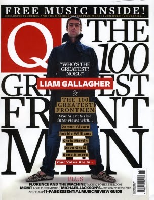
Comparing my magazine with the other three magazines I have selected which I felt were the most important; being well known among many music fans across a wide age range and in the same genre boundries as mine (indie/rock), you can see the obvious simularities between the proffesional magazines (NME, Q, Rolling Stone) and my final product. The simularities of mine and the real music magazines, would be the attention to detail of the large Masthead, a range of straplines with various angle arrangements, the clever use of mise-en-scene to target my audience and attitude, editing, styles, fonts, use of language and 'slang' to interact with my target audience, colour choices to fit in with the overall 'mod' scene of my magazine, use of text etc.. Another way how I feel my magazine challenges other music magazines, particually Q, is that I have a proud and confident male standing shoulders above the rest on my front cover to set the example of the main sell. I also feel that the expression and body language of my main cell image challenges other leading music magazines, because it shows my model as almost angry and aggressive towards the camera. The way that my models are dressed also challenges other magazines, particually Q, as my main cell is dressed similar to Liam Gallagher e.g. long duffel coat, plimsolls etc..

One of the things which is obvious to compare my music magazine to the others; Example: Q's choice of colour particually on the masthead is a simple but effective way of connecting to its target audience. The deep red, magazine, is the use of colours I have used, to make the outlook of my magazine lash out to my target audience. The reds, whites and blue's I have used espeically on my strapline, give the effect of a 'mod' scene. I feel that using these bright primary colours, it gives a 'happy' feel towards my magazine. This is conforming and using the normal conventions of the indie scene. This will attract my music fans as the type of bands i have included, fit the part perfectly. The use of striking images I have used particually the main cell and the slanted text of my masthead, gives the image of a 'wierd but wonderfull' outlook, which I feel will attract my reader even more due to the hardcore, radical and individual genre of music I am focusing on.


Friday 12 March 2010

Friday 29 January 2010

Sketches

Front Covers:
1.


2.


3.


4.


Contents Pages:
1.


2.


3.


Double Page Spread:

1.


2.

Audience Profile- Target audience:

Gender
. Since the start of my magazine production and planning, i have tried to aim the magazine at the male gender. I was going to try and make it a more unisex magazine by including a more femenin side, such as different girls products like posters and T-shirts, but i feel that as i am giving the magazine a hard-hitting mod/indie feel, this would be more ideally suited for males. Although i am not excluding the female side of my magazine, i also belive that a niche audience of women may read this if they are into products such as Vespas, and 'blokes' news, such as football, violence, banter, clothes/clobber and cars.


Target Audience
. When i first starting researching and planning for my music magazine, i was going to aim it at a much more younger audience (14-16). I believed that as younger teenagers are completely upto date with their music, i thought i would get a wider audience range because as i am introducing a more niche audience with bands that are unisgned or unknown, this would be my greatest audience.


After researching a number of college students and attained their feedback, I feel that the age range 18-24 would suit my magazine best. This is because i am going to include older bandssuch as Oasis, Blur and The Stone Roses in my magazine, which younger teenagers may not be so familiar with. I also feel that because most 18 year old boys are going 'indie', this will give my magazine an even bigger audience.


Fanbase
. Originally i felt that i wanted a wide fanbase, who purhase the magazine each week and to be sold in most shops and music stores, but also after long consideration i feel that i want a more niche market, where the magazine is to be sold in either independent record shops or in various small shops like small clothing stores such as Jingo with a good reputation. I felt i wanted to use this idea as it would make the reader feel more priviliged/loyal reading it, as there would only be certain copys available to order. I also feel that by selling them in these small unique shops, it will make the overview and reputation of the magazine retro/vintage and 'back in business'.


Clothing
When i was first researching for my music magazine, i wanted my target audience to wear designer logo's such as Billionaire Boys Club/ Ice Cream, Vivienne Westwood, Dior, Alexanda Mcqueen, Gucci, Louis Vuitton etc. After doing more research about my target audience, i found that most of these labels were too 'extreme' and wouldnt fit my genre of a indie/mod look. This is because most of the people that wear these designer brands are more into Hip-Hop and support artists such as Kanye West, Drake, Jay-Z, Lil Wayne etc.
Although i am not including these brands in my magazine, i will include more indie and hard hitting labels such as Pretty Green, Folk, Stone Island, Fred Perry,Luke etc. Another reason for including this is that the price of these clothing labels are not as expensive and extreme as the 'hip hop' fashion ones.


Tuesday 19 January 2010

Audience Research- Moodboard Feedback:


After succesfully uploading my moodboard onto facebook, i had some very useful feedback about the genre, age group and what i needed to improve, by the audience who wrote on my collection of images. Wth my initial questions being based around:
. What genre would this apeal to most?
.What age group is it best suited for?
. Any critisisms or problems with my mood board?
I found that many people were civilised enough and answered the questions correctly with more than enough detail. With lots of information and details about my moodboard, it was quite difficult to pick from the best.
These are a few i picked which i felt were most useful to me in making the final decisions about my magazine:

1
-I would probably say this is a very contrasting piece as the backgrounds vary greatly from the brighter colours of red to the subtle colours of browns and greens...I like the way you introduced more indie bands to the piece and more innocent childish things as in the bicycle etc .. Veryy good mood board..You can tell it would be aimed at the older age 16 onwards as it has a very sophiscated appeal which wouldn't relate top the younger generations.
2
-I think that the genre for your moodboard is indie with a slightly 'mod' feel to it. One of the ways why i think this, is because there are various pictures of people in Parkas and Winkle picker shoes. I feel that it would be ideally suited and aimed at males between the ages of 16-26. Another thing i can see on this mood board is various designer brands such as Luke, Pretty Green and Fred Perry. This appeals to me as I am a follower of fashion and suggests that this magazine is for the 'trendy' side of indie. I alo think that with the bright colours, this will appeal to its market audience because they will stand out among the rest. Overall a great moodboard although i feel it is a bit masculine and could include a more femenine side to it by including womens clothing, or maybe even by having your main picture as a a woman and a man. :)

3
1. the genre indie
2. mainly aimed young men
3. no
- the bright colours will make the magazine stand out!

Monday 18 January 2010

Summary of your research into existing magazines:

. The magazines i have looked at both include a lot of 'hard hitting' fonts. These are used for the titles, sub headings and quotes to express and emphasise new bands on the scene and up and coming events such as festivals. The different fonts can range from what type of band it is. for example if an indie band such as the arctic monkeys are on the front cover, or are featuring in the magazine, there is usually a more 'underground' style of font used. With other bands such as the Beatles, more upper class and formal fonts are used, which look to the reader as being more easy to read.
: For example the font used for The Libertines logo is what the magazines i have researched use regularly to express what is in the magazine. This is also known as Distorted font and i feel that by using this type of font in my own magazine will give it the more underground and indie feel that i most desire to be in my final poduct.
. The fonts that are used particularly on the front cover, usually contain deep/bright colours to express their importance, which will attract the readers attention even more than basic colours such as black and white. The colours that i noticed that were being used were mostly red and gold. (NME & Q magazines)

. The magazines i have looked at also include a large image on the front cover, showing what is the most important and main article in the magazine. On the back of the magazine it usually includes advertising of different music products such as headphones. I will hopefully include all of this data in my own music magazine. Also on the front cover it shows smaller images of the other articles featuring in the magazine.

. Another thing that i have noticed is that the magazines usually have a main, central image on the magazine face. This immediatly implies to me that this is the main feature and article in the magazine. The magazine also has smaller images labelled and scattered around the front cover. I feel this is a useful key to selling the mag as it directly shows the reader/audience what is in the magazine.

. I have also noticed that the smaller images on the front cover displaying what order they are in the magazine, have various different backgrounds, weather they're hard hitting which stands out to the reader directly (action shot) for example if the image was taken at a festival or session, or if the image has been shot in a studio. On my magazine cover i intend to include a range of action shots such as a seaside session in Brighton, and hopefully use some studio images where the background doesnt stick out to the reader as much.