NME Magazine:

Rolling Stone Magazine:

The Reign Magazine:

After long consideration, changes made and photographs taken, making the completed copy of my music magazine the most professional and succesful quality possible, I feel that my final media project is both simular in many respects, due to the same or simular conventions and design. I also feel it pushes the boundaries and connotes a different reading aspect to music magazines such as the language technique and the imagery.
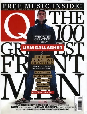
Comparing my magazine with the other three magazines I have selected which I felt were the most important; being well known among many music fans across a wide age range and in the same genre boundries as mine (indie/rock), you can see the obvious simularities between the proffesional magazines (NME, Q, Rolling Stone) and my final product. The simularities of mine and the real music magazines, would be the attention to detail of the large Masthead, a range of straplines with various angle arrangements, the clever use of mise-en-scene to target my audience and attitude, editing, styles, fonts, use of language and 'slang' to interact with my target audience, colour choices to fit in with the overall 'mod' scene of my magazine, use of text etc.. Another way how I feel my magazine challenges other music magazines, particually Q, is that I have a proud and confident male standing shoulders above the rest on my front cover to set the example of the main sell. I also feel that the expression and body language of my main cell image challenges other leading music magazines, because it shows my model as almost angry and aggressive towards the camera. The way that my models are dressed also challenges other magazines, particually Q, as my main cell is dressed similar to Liam Gallagher e.g. long duffel coat, plimsolls etc..
One of the things which is obvious to compare my music magazine to the others; Example: Q's choice of colour particually on the masthead is a simple but effective way of connecting to its target audience. The deep red, magazine, is the use of colours I have used, to make the outlook of my magazine lash out to my target audience. The reds, whites and blue's I have used espeically on my strapline, give the effect of a 'mod' scene. I feel that using these bright primary colours, it gives a 'happy' feel towards my magazine. This is conforming and using the normal conventions of the indie scene. This will attract my music fans as the type of bands i have included, fit the part perfectly. The use of striking images I have used particually the main cell and the slanted text of my masthead, gives the image of a 'wierd but wonderfull' outlook, which I feel will attract my reader even more due to the hardcore, radical and individual genre of music I am focusing on.
No comments:
Post a Comment